COVID-19 Maps
Since the spread of COVID-19 began in the US, I kept seeing the same graphs shown on the news. Namely, only the total number of cases were shown. This logically distorts the conversation about the impact of COVID-19 to areas with larger populations–they can have more cases because there is a larger population in New York City than in rural Georgia.
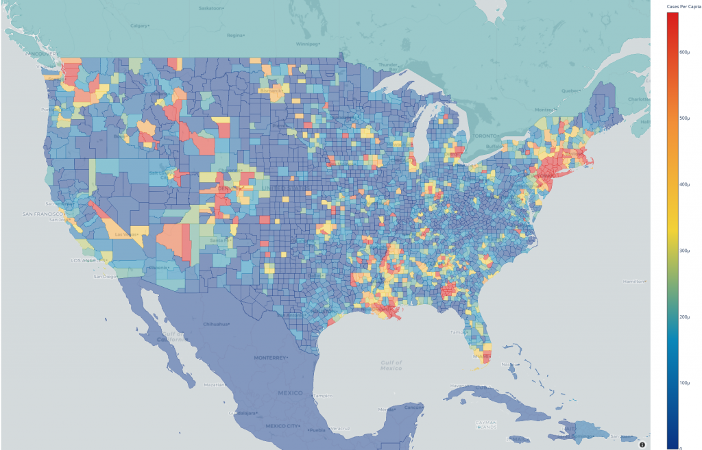
Therefore, I have created a set of maps to show the impact of COVID-19 per-capita, or in plain talk, the number of cases divided by population. Since I began working on this, several line charts have appeared “per 1,000 population” or “per 1,000,000 population,” which is closer to what I was looking for. My maps, on the other hand, allow you to visually drill down to the US County level. Additionally, you can view the spread over time and at different resolutions (US County, US State, Country).
TL;DR Where are the maps???
There are currently four maps available:
Or, if you have a huge monitor, you can view all four maps simultaneously.
Methodology
Disclaimer: I am no data scientist. My background is in Biological Sciences and education.
When making these maps, I considered that my job is to merely assemble the data from disparate sources and display it in a form that allows one to draw their own conclusions from the data. The US state and county data is pulled down from the same data that the New York Times uses in its reporting. To calculate the per capita data, I used the 2019 population estimates from the US Census Bureau. Country level data is from the European Centre for Disease Prevention and Control whose data set includes population estimates for countries in 2018.
To improve the overall readability, I tweaked the presentation of the per capita and total graphs. In both cases, simply allowing the Plotly graphing library to display colors over the range of data caused most of the US to be in the minimum area of the range. This made it difficult to parse the maps at a glance. To correct this issue, the per capita maps scale such that the maximum color displayed is the mean plus the variance while the minimum is the higher of zero or the mean minus variance. On the other hand, the total maps are scaled by the range of the log base 10 of the values.
The maps are generated by Plotly Python’s Choroplethmapbox and are highlighted using GeoJSON files that I customized from other sources. US Counties and States were derived from the US Census Bureau cartographic boundary files. Country boundaries were derived from Natural Earth’s Cultural Vectors. These boundaries required some tweaks for countries with incorrect or missing ISO-3 values and countries whose international recognition is questionable at best.
Final Words
If anyone would like to inspect my work, I have made the source code available under the GNU GPLv3 license on GitHub. If you use my work in any reporting or other venture, please give me credit, and I would love to hear about it!
I still intend to improve these maps by adding a GiHub Action to regenerate and upload them periodically–currently I must regenerate and upload them manually.
Special thanks to folks to kept looking over my graph revisions and tolerating my complaints about <insert list here>: “aqua”, Joseph “Deledrius” Davies, Mark Hardin